Enhancing Desktop Discoverability and Navigation for The Met
With Insights from Eye-Tracking and Behavioral Analytics

COMPANY
The Metropolitan Museum of Art (The MET)
DURATION
12 weeks
TEAM
Katie Im, Sagarika Konanuru, Van Nguyen, & Sayali Nikumbh
IMPACT
Identified design recommendations to lower bounce rates and enhance user engagement.
Built a multivariate test plan for the client to launch.
The Opportunity
As a world-renowned cultural institution, The Metropolitan Museum of Art (The Met) attracts millions of visitors both in person and online every year. However, our clients approached us after noticing a concerning drop-off in visitors to The Met's "Perspectives" section on the website.
To address this challenge and enhance user engagement, our team of four designers identified pain points and looked at how visitors interact with the "Perspectives" section for Desktop. As usability experts, we designed tests to validate our assumptions using a blend of qualitative and quantitative methods.
Employing eye-tracking tests and behavioral analytics, we explored user behavior and preferences on the Perspectives page, leading to four actionable recommendations and a comprehensive multivariate test plan.
Our Process
RESEARCH QUESTIONSHow do users navigate and engage with The Met's desktop website, specifically the Perspectives section?
What is the initial user experience regarding the intuitiveness and clarity of the Perspectives section for first-time visitors?
How well does the Information Architecture and content hierarchy of the Perspectives section on desktop contribute to effectiveness and efficiency, including searchability and sub-navigation across different content types?
METHODOLOGYTo gain insights into the existing user experience, our team conducted an initial evaluation of the page. As usability experts, we were able to pinpoint three main issues with the site. With these insights, we set up relevant tasks for our eye-tracking study and spot trends in the analytics.

The Analysis
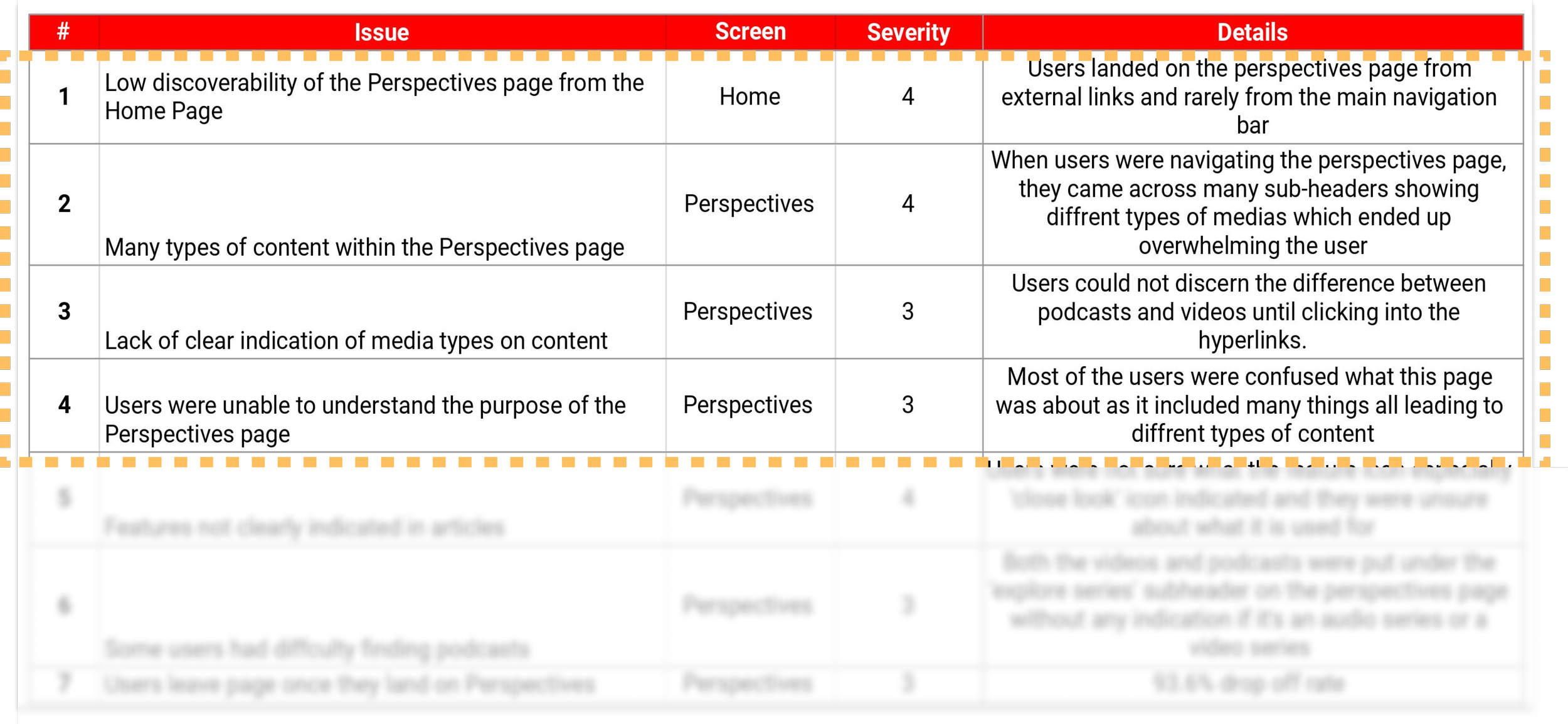
PROBLEMS LISTThe majority of our participants reported a positive experience with The Met's desktop website, especially enjoying its aesthetically pleasing visuals. However, the Eye-Tracking testing unveiled areas with potential for improvement to enhance overall usability.
Through the completion of four tasks by our participants, seven recurring themes emerged. After careful consideration, we narrowed down our focus to four issues, prioritizing those with the lowest implementation effort and the greatest potential impact:
SYSTEM USABILITY SCALEAfter completing the tasks, we asked participants to score the Perspectives section on its usability using the System Usability Scale (SUS) to understand the performance of the website in terms of a quantifiable usability scales.

Findings & Recommendations
1. Improve Discoverability from Homepage
FINDINGS6/8 of our users struggled to locate the Perspectives Section on the Home Page via the Navigation bar, highlighting a lack of clear identifiers and diminishing discovery rates.
For Task 1, users initially sought the 'Perspectives' section on The Met's Home Page by checking the main navigation bar. If unsuccessful, they turned to the search bar.

When compared to other sections of the MET's website, the Perspectives section receives less than 1% of the overall site traffic, with approximately 67% being new users. This underlines inadequate discoverability and engagement.
RECCOMENDATION #1Renaming the header in the navigation bar. Using the vocabulary ‘Perspectives’ and indicating that it is a learning source from experts would help users understand the context and content within the submenu item.

2. Enhance Clarity of Purpose and Context
FINDINGS6/8 users requested more context once landing on the “Perspectives” page, reflecting the difficulty in grasping its content and usage. Many users were perplexed by the section's multifaceted offerings, leading to confusion about its purpose and diverse content.
Even post-testing, users encountered difficulty elucidating the purpose of the Perspectives page, despite being provided time to explore the section.

Our HotJar's scrollmaps of the main Perspectives page show user attention peaks above the initial screen area, tapering down as they scroll. No specific focal points emerge.

Google Analytics data indicates users often enter from related pages but quickly leave the Perspectives Main page, with a 85% drop-off. This suggests content comprehension issues and why visitors leave instead of interacting with the section.

RECCOMENDATION #2Adding a description or blurb underneath the header. Improve user comprehension by introducing a concise description or subheader outlining the Perspectives section's objectives and content diversity. This contextual addition will empower users to navigate and explore the section with greater confidence and engagement:

3. Optimize Content Organization and Labeling
FINDINGS3/8 users expressed feeling overwhelmed by the volume of content and diverse media types on the Perspectives landing page. Our eye-tracking revealed challenges in locating specific content within the section, underscoring the necessity for enhanced navigation through the array of media types.

Heatmaps reveal users seeking guidance gravitate towards subheadings; improved content labeling and organization could boost user confidence, enhancing navigation and overall site experience.
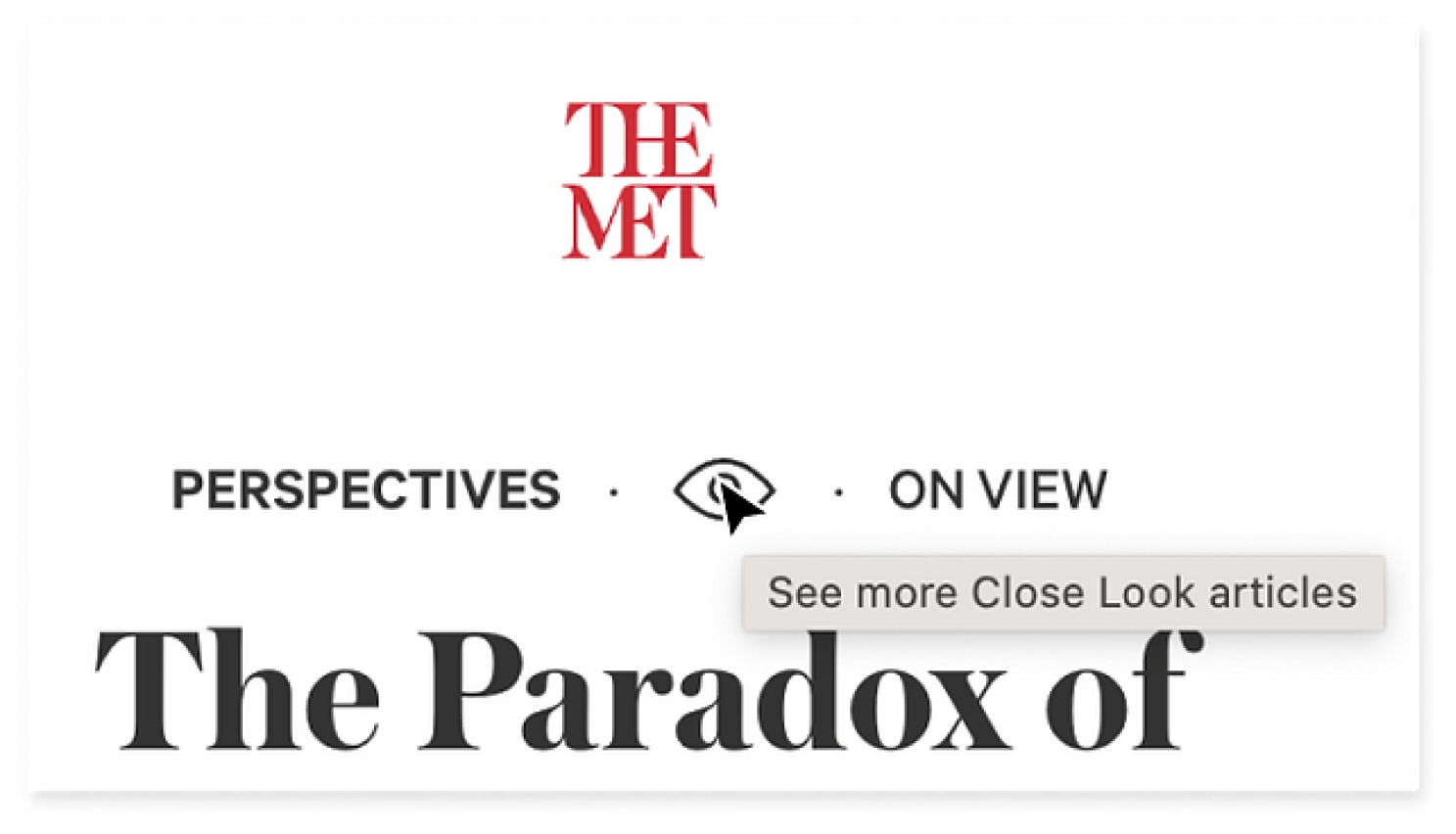
The Close Look feature enables interactive examination of artifacts and art pieces, revealing details while users scroll and interact. All 8 users easily identified its icon (an eye).
When prompted to locate a 'Close Look article,' users cited the icon's aid in task completion. Notably, the tooltip served as a confirmation tool, emphasizing the significance of maintaining consistent icon and tooltip usage for effective navigation.
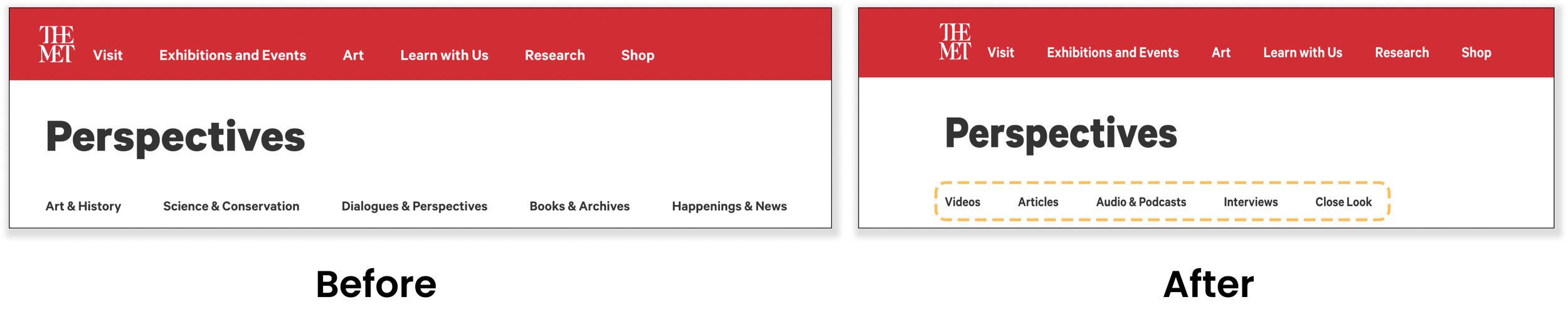
RECCOMENDATIONS #3 Renaming subheaders and categorizing by content types. Relabeling the subheaders to media types will give users a clearer idea of the types of content on the page and how to sift through them. This variation was also implemented in the team’s multivariate test proposal section.
RECCOMENDATIONS #4Creating consistent media type icons and tooltips. By adding a tooltip in addition to the icon for recognition of each content card, users can be sure of the media type prior to clicking on the page.

Next Steps…
MULTIVARIATE TESTINGWe presented The Met's team Google Optimize multivariate test with the goals of validating recommendations, guiding significant design decisions, and improving user experience based on data-backed enhancements.
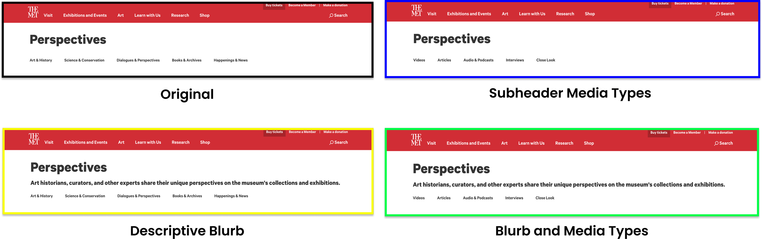
IMPLEMENTATIONGiven the Perspectives page's lower visitor volume than other sections, we extended the test duration to six weeks, aiming for an even 25% split across all testing variations.

By focusing on these metrics, we hope to improve the overall user experience on the website and encourage users to explore the Perspectives section further.
Primary measurement is a decrease in Bounce rate.
Secondary measurements include an increase in Clickthroughs and Session time.
Main Takeaways
The clients appreciated our research and recommendations and hope to implement our changes as soon as possible. With validation from the multivariate test, we hope these recommendations will result in a lower bounce rate and higher engagement levels for the Perspectives section.
Throughout the project, our team learned the importance of data-driven decision-making and the impact of small design changes on user behavior. We believe that by continuously prioritizing user experience, The Met can create a website that truly captivates its online visitors and fosters a deeper appreciation for art and culture.
Rescue City Redesign

